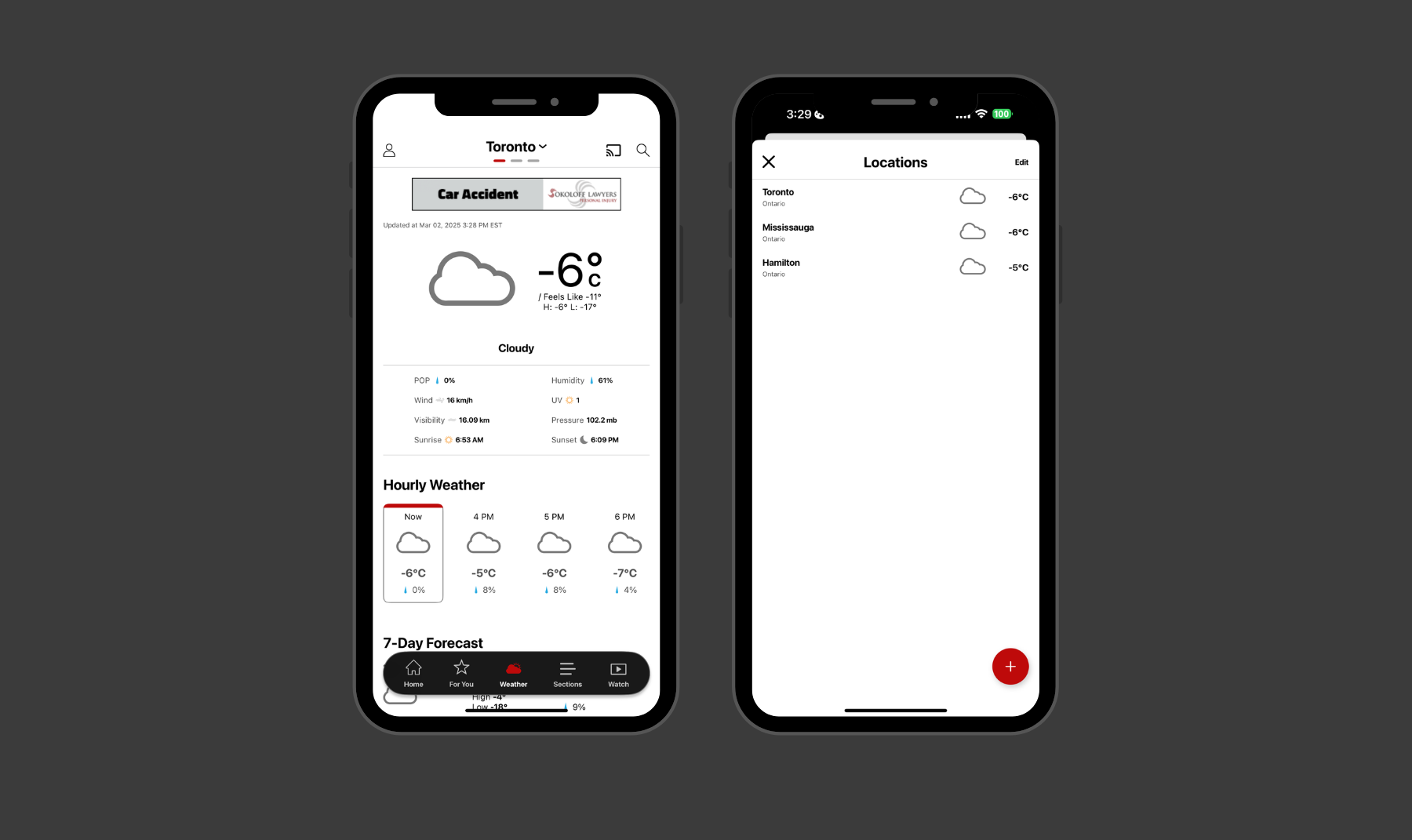
CP24 Weather Tab redesign showing the weather view and saved locations

Case Study · Bell Media / CP24

Weather Tab

CP24 is Toronto's 24-hour news channel. Weather is one of the main reasons people open its app, and switching cities was the part they kept struggling with. I redesigned it inside an app redesign already in flight. The layout carried into CTV News, the two apps came to share a search pattern, and the same weather view became a widget in the local section.
Platform iOS and Android
Role Product Designer
Shipped September 2024
Outcome 40% to 100% task completion
Methods Competitive analysis, feasibility review, behavioral testing, benchmark testing
Team Product, Editorial, Engineering, Content Design

Switching cities was broken

I ran usability benchmarking on the apps every quarter. City switching had surfaced in earlier rounds and came up again in the most recent one. The goal was clear: make moving between cities feel natural enough that users never have to think about it.

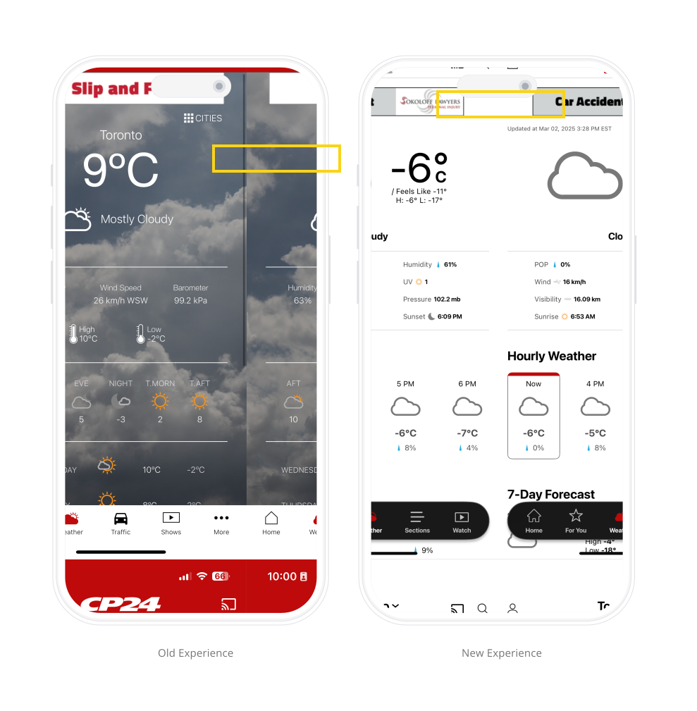
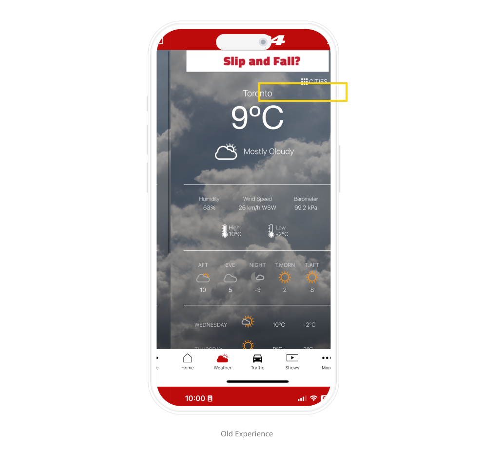
The original CP24 Weather Tab with the city switcher in white text over a full-bleed photo background

Existing Research · Benchmarking · Q4 2023

  • Task completion40%
  • Time on task35 seconds
  • Errors per task3

Known issues with the old experience

  • The city name was tappable and opened the locations list, but people did not read it as a control.
  • The name was set in white over a full-bleed photo that rotated with conditions and time of day, so contrast shifted with whatever image loaded.
  • A contrast check against the photo set found the header fell below the 4.5:1 minimum against roughly a third of the images.

Borrow, do not invent

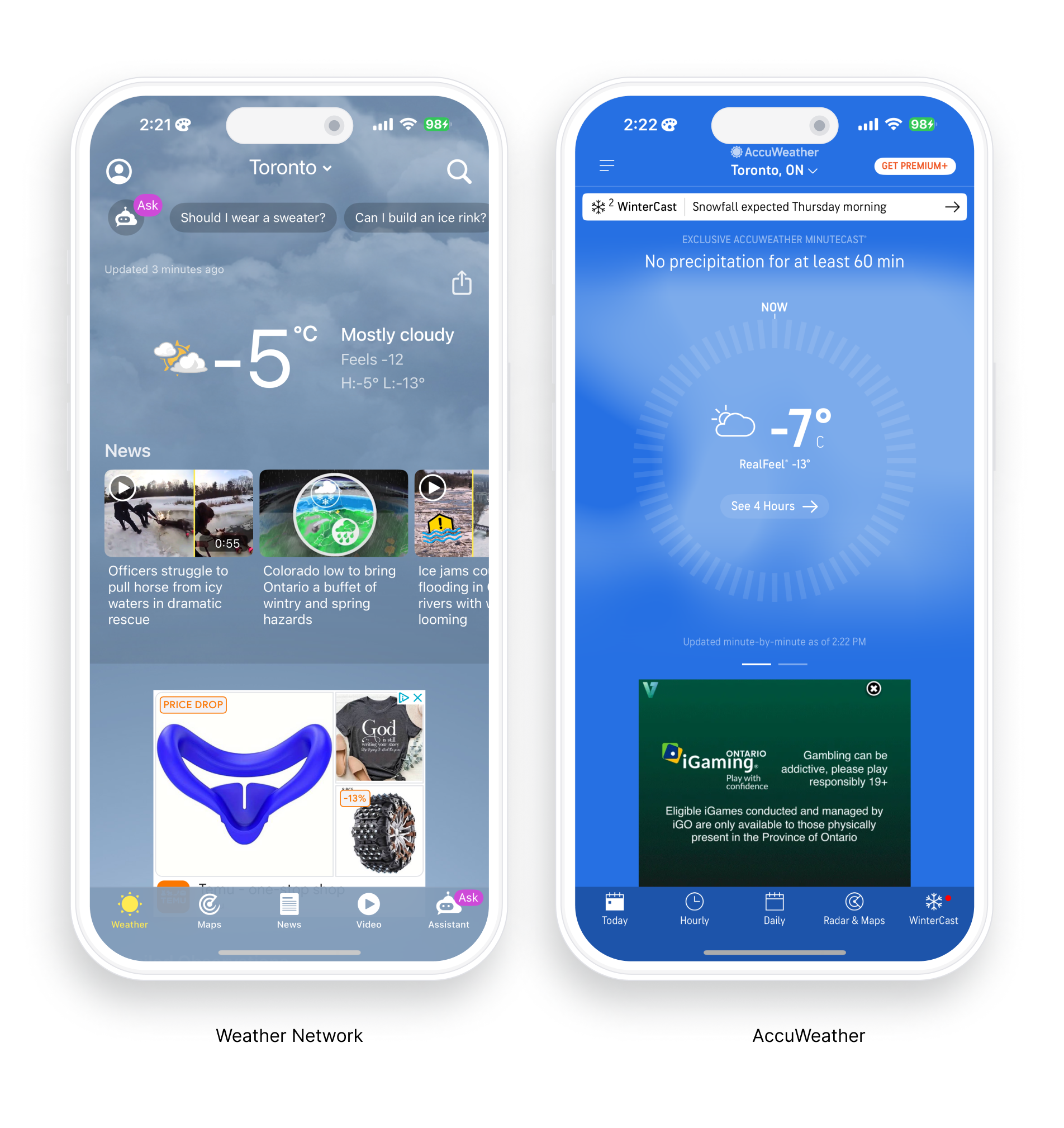
Before designing, I looked at how leading weather apps handled city switching to identify patterns worth borrowing. Users arrive at CP24 with habits formed elsewhere, so I ran the same task on AccuWeather and The Weather Network with 5 participants in Canada who check the weather daily or weekly on their phone.

Competitive review of The Weather Network and AccuWeather

What participants asked for, separate from what I watched them do

  • Participants wanted fewer ads while scrolling, the most common complaint across both apps.
  • Participants wanted hourly forecasts higher up, since the real question is whether it rains in the next hour.
  • Participants wanted wind and humidity without digging for it.
  • Participants wanted to swipe between cities, with recent and favorite locations saved. Both shipped: the swipe gesture and the saved locations list.

Which route users took

Method

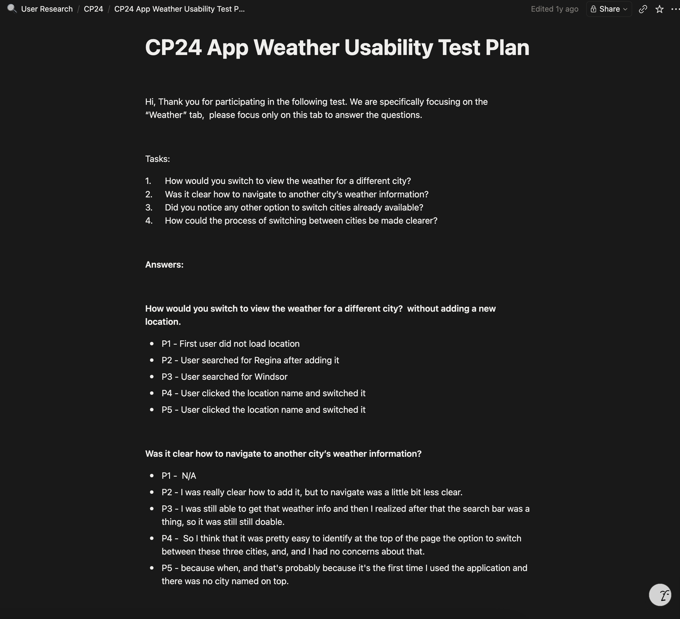
I recruited participants who check the weather daily or weekly, 5 on each app, and watched one thing closely: which route they took to switch cities. Most attempts ended at the right screen, so the signal was path, not outcome.

CP24 App Weather Usability Test Plan showing tasks and raw participant answers

Key takeaways

  • Participants who tapped the location name switched with no trouble, so the control worked whenever it was noticed.
  • Participants who reached for search instead still described the top of the screen as where they expected to switch.
  • One participant tried the menu icon before discovering the swipe gesture, expecting navigation to sit in a familiar pattern.
  • Participants suggested a label or a short tutorial, while the ones who never struggled already knew the control from AccuWeather.

Buildable before beautiful

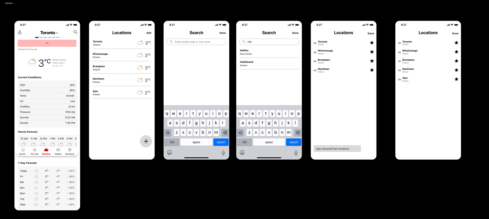
With the research settled, I moved into wireframes and took them to our weekly engineering meeting. Two questions mattered: whether the data feed could support saved locations and reordering, and whether swiping between cities was buildable on both platforms.

Once feasibility was confirmed, I walked our UX writer through the flows and we reviewed new copy each week. Search field placeholders, the empty state when no cities are saved, whether the header should read Weather or the selected city name. Copy was decided alongside the design, not filled in at the end.

Wireframes for the weather view, saved locations, search, and reordering

Three decisions

The redesign came down to making the city control impossible to miss, without losing the information people came for.

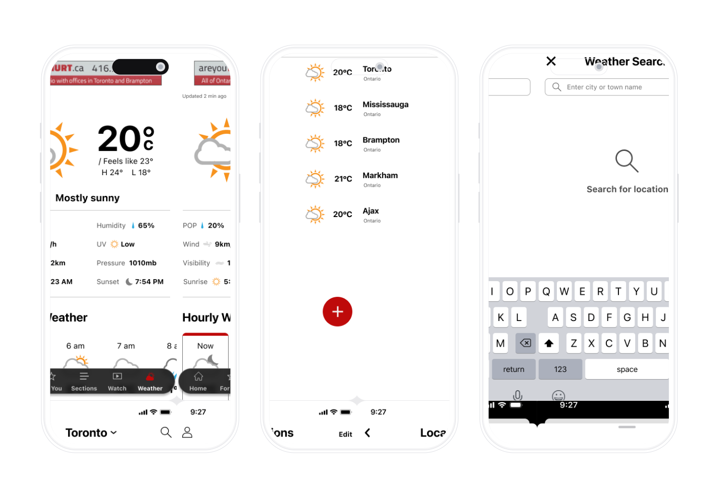
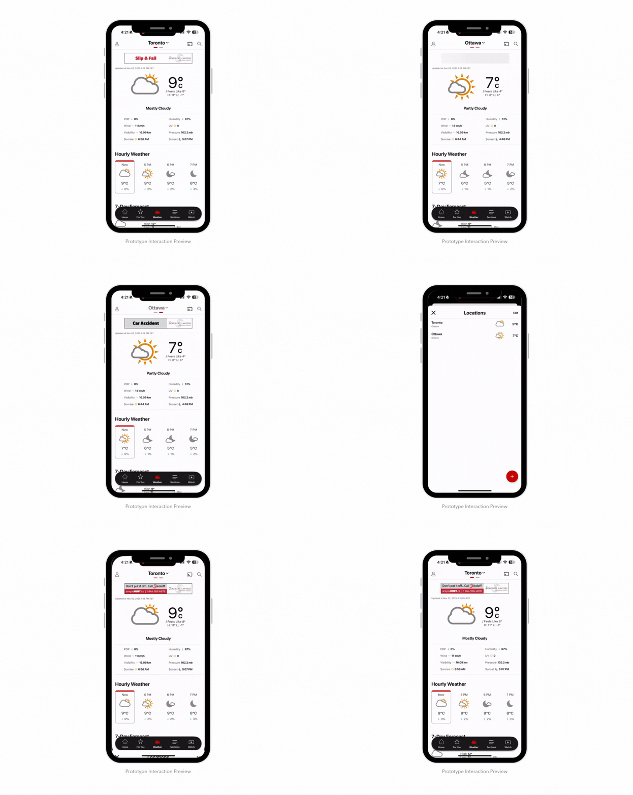
The redesigned CP24 Weather Tab, saved locations list, and city search
1

Removed the Photo Background

There was no version where the city name held contrast reliably, because the photo was never predictable. The tab became a white surface with the name in solid dark text. I gave up the atmosphere participants liked in The Weather Network, and I would rather it read every time than look alive most of the time.

2

City Name as the Title

The affordance people expected already existed in the category and CP24 technically had it. I gave it the strongest position on the screen, centred with a chevron beside it. That is the discoverable path and it works for a first-time user.

3

Swipe That Announces Itself

Solving a discoverability problem with an invisible gesture would be fair criticism if swipe were the only way through. It is not. The tappable header always works, and swipe is a shortcut for people who already know the app. A row of dots under the city name shows how many cities are saved and which one you are on, so the gesture becomes guessable rather than hidden.

The shipped CP24 Weather Tab scrolling from current conditions through hourly and the 7-day forecast

40% to 100%

After the September 2024 launch I ran a benchmarking usability test comparing the old tab against the new one on the same tasks. Completion, time, and errors are measured across 10 task attempts per version. An error was any tap that did not move the task forward, such as opening the wrong menu or backtracking to try a different path.

The old CP24 Weather Tab beside the redesigned one

Before

Old Weather Tab

People hunted for a way to change cities, guessed, and backtracked.

  • Task completion40%
  • Time on task35 seconds
  • Errors per task3

After

New Weather Tab

A legible header and swipe between cities made the path obvious.

  • Task completion100%
  • Time on task15 seconds
  • Errors per task0

Scaling to CTV News

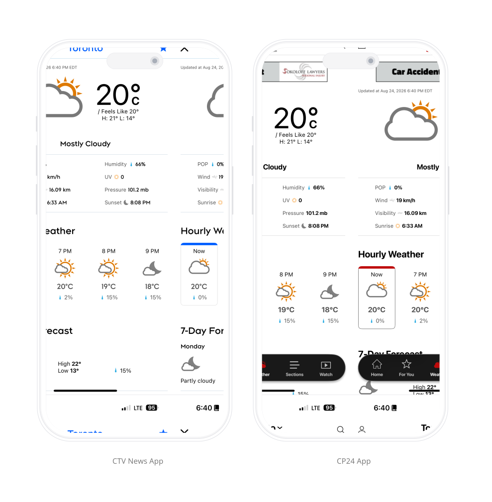
CTV News was next in Bell Media's News Evolution sequence. It already had its own weather feature, but rather than redesign a second one, we brought this one across. Three pieces carried over.

1. Shared weather design

Same structure, same hierarchy. Only the accent color changes.

The weather experience running in both CP24 and CTV News

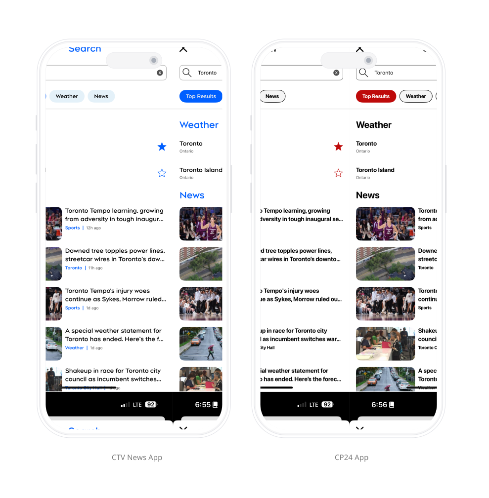
2. Shared search

Weather results sit in their own group above news, with a favorite control so a city can be saved from the results.

Weather results inside unified search on CP24 and CTV News

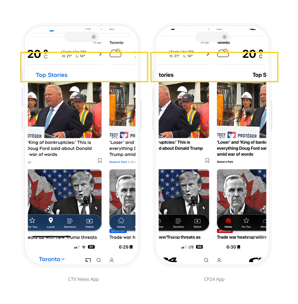
3. A widget for CTV News

Weather there is context for local news rather than a destination, so it became a widget in the feed instead of a tab.

The weather widget in the CTV News local section in light and dark mode

What this project reinforced

1

Invisible is not the same as missing

The way to switch cities was on the screen every time. The problem was never the pattern, it was that people could not see it depending on the photo behind it. Naming that correctly kept the fix small instead of turning it into a redesign of something that already worked.

2

Proven patterns travel further than new ones

Adopting the city control people already knew from AccuWeather meant the design arrived with habits attached. That is also why it transferred cleanly into CTV News. A pattern validated on a live product with real users does not need to be re-argued on the next app.

3

Constraints shape the work more than preferences

The photo background gave the tab personality, but it could not guarantee the city name stayed legible. I gave up the atmosphere for a surface that reads correctly every time, and that trade is usually the difference between a concept and something that ships.

Next Project

TSN Connected TV: On-Demand Game Discovery

10-foot UI · Usability testing · Content discovery