
Case Study · Bell Media / TSN
Ongoing
TSN Connected TV: On-Demand Game Discovery
The TSN Connected TV app had a strong live experience but a serious blind spot: on-demand content. 93% of watch time was live. Everything else was buried.
Case Study · Bell Media / TSN
The TSN Connected TV app had a strong live experience but a serious blind spot: on-demand content. 93% of watch time was live. Everything else was buried.
01 · Challenge
In stakeholder meetings, the team presented usage data showing that users were almost exclusively watching live content. The number one requirement coming out of those meetings was clear: increase the visibility of Games on Demand and drive video views beyond live.
02 · The Problem
Games on Demand was on the home but buried deep. Users had to scroll past multiple content categories just to reach it. On a TV remote that adds up fast, and most users never made it there. The content existed. The path to it did not.
Finding a game on demand required navigating deep into the app with no shortcut from the home.
03 · Competitive Analysis
Before designing, I looked at how leading sports and streaming apps handled content discovery to identify patterns worth borrowing and gaps TSN had not addressed.
Key findings
04 · Research
I ran unmoderated usability testing to pressure-test the existing experience. Participants used a prototype with remote navigation while narrating their experience out loud. Three tasks were tested: finding the most recent Games on Demand, locating a specific TSN+ documentary, and finding the NHL News page.
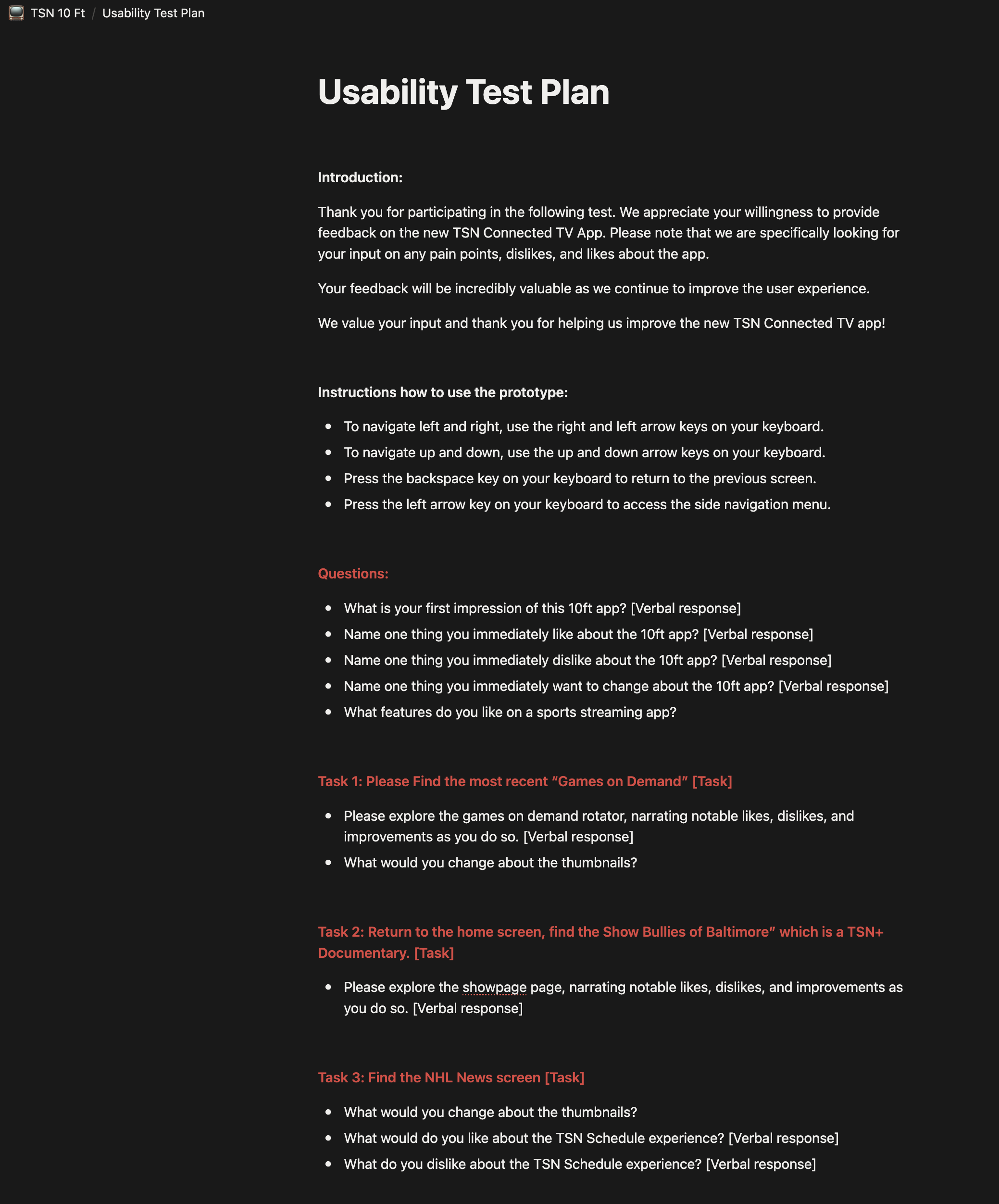
Usability test plan
What users told us
05 · Solution
The redesign focused on one thing: making Games on Demand and documentary content discoverable from the moment a user opens the app, without removing the live experience they relied on.
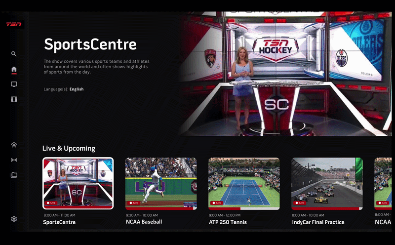
The redesigned home brings Games on Demand, For You, and What's Trending to the surface without any extra navigation.
Five decisions drove the redesign, each one tied directly back to what users told us and what the data showed.
Games on Demand was moved higher up the home, giving it a dedicated row above the fold. Game replays are now one of the first things a user sees when they open the app.
An editorial row surfaces TSN's documentary catalogue on the home. The same approach Netflix uses to drive passive discovery. Users no longer need to search for docs.
A personalized row based on the signed-in user's favorite teams and viewing history. A Toronto Raptors fan sees Raptors content. A hockey fan sees hockey. Relevant content surfaces without manual searching.
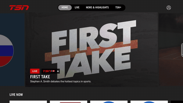
Live cards play a preview when focused rather than showing a static thumbnail. A still image of First Take gives no signal that it is airing right now. Motion does.
Focus states now use a stroke around the active card rather than a scale transform, a cleaner way to show where the user is without shifting the layout.
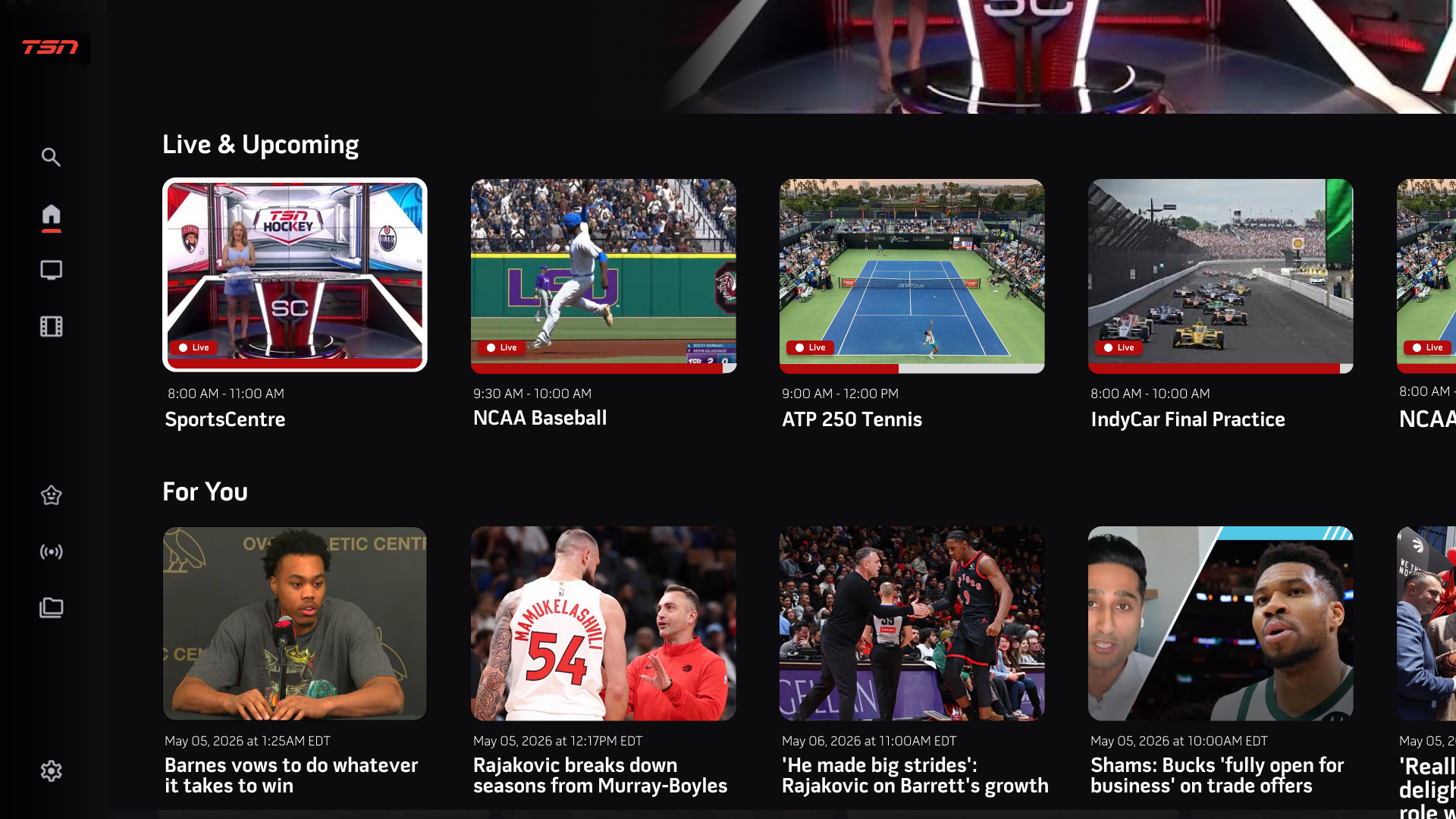
Redesigned home screen. Live Now stays at the top, with Games on Demand and For You rows directly below it.
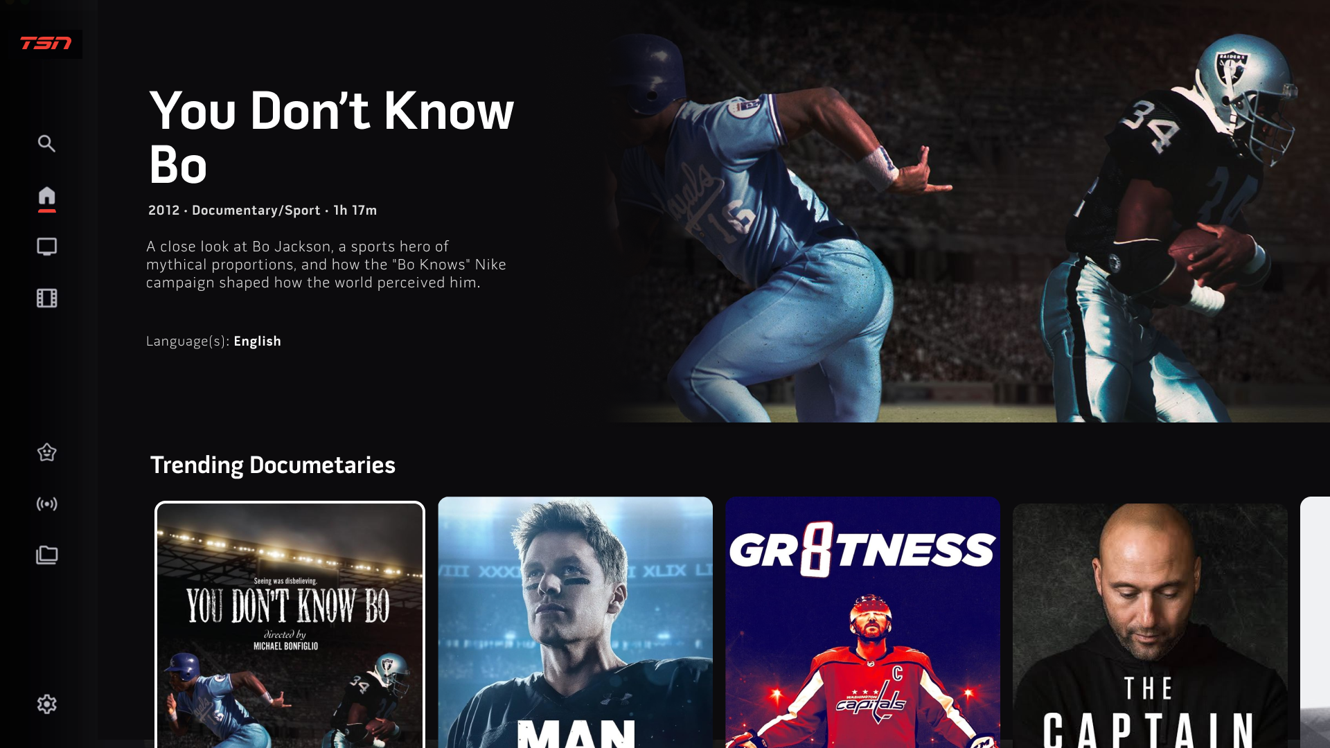
As users scroll past For You, the Trending Documentaries section comes into view.
Each doc surfaces with its title, genre, runtime, and description reused from the show page so users can decide before they click.
06 · Design Consistency
Following the Crave Connected TV launch in October 2025, TSN was built on the same design instance. The left side navigation, content rows, focus states, and thumbnail patterns all carry over, keeping the experience consistent across Bell Media apps.
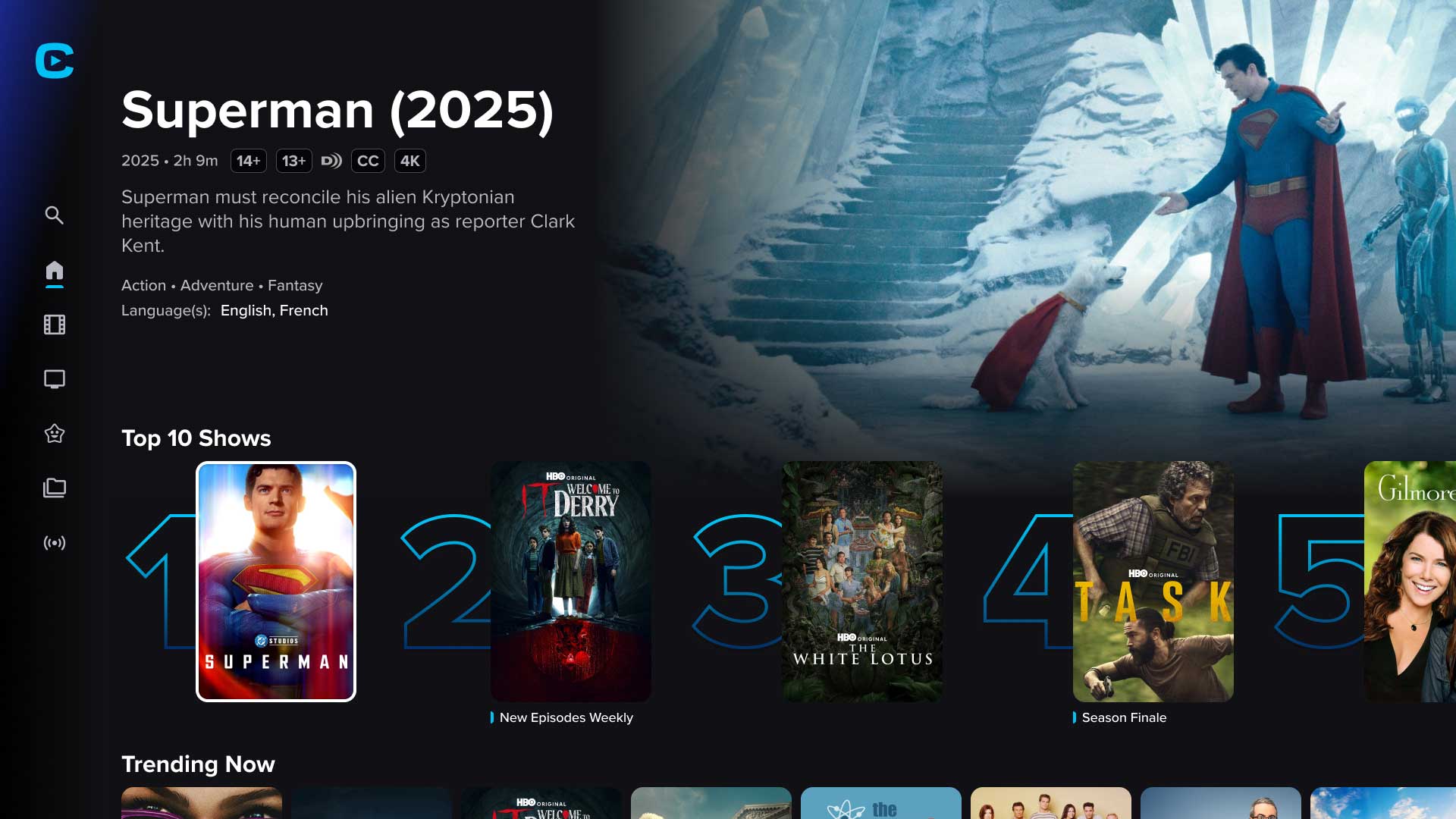
Crave

TSN redesign
07 · Measurement & Next Steps
As this project moves toward launch, we are establishing a telemetry and tracking framework to measure long-term success against our initial baselines.
Measuring the drop in interaction time from app launch to on-demand video playback start. Fewer remote presses, faster path to content.
Tracking the percentage shift in overall watch time away from the 93% live baseline. The goal is a measurable increase in on-demand and documentary starts.
Collaborating directly with engineering to run QA on focus physics, remote responsiveness, and text legibility across diverse TV hardware environments before rollout.
08 · Key Takeaways
The problem was never the depth of TSN's content catalog. It was that users lacked an intuitive path to stumble across it. By rearchitecting the layout hierarchy, the content finally has the canvas it needs to be discovered.
Working hand-in-hand with the entertainment design team behind Crave meant our component decisions had to scale cleanly across both sports and entertainment contexts. Sharing a design instance across Bell Media pushed the work to a much higher system standard and saved significant engineering hours.