.png)

I began by meeting with product team to clarify goals, scope, and success measures.
The mandate was simple: make it easier for users to check local weather conditions and switch between cities without friction.
Once requirements and user stories were confirmed, I moved into discovery and validation work to understand the current experience and user expectations.
To ground decisions in user behaviour, I ran unmoderated usability tests on AccuWeather and The Weather Network with Canadian users who check weather daily or weekly on their phone.
Participants completed core tasks such as switching cities, checking current conditions, and scanning hourly forecasts.

Patterns That Worked Well:
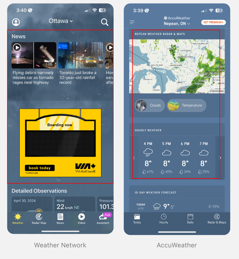
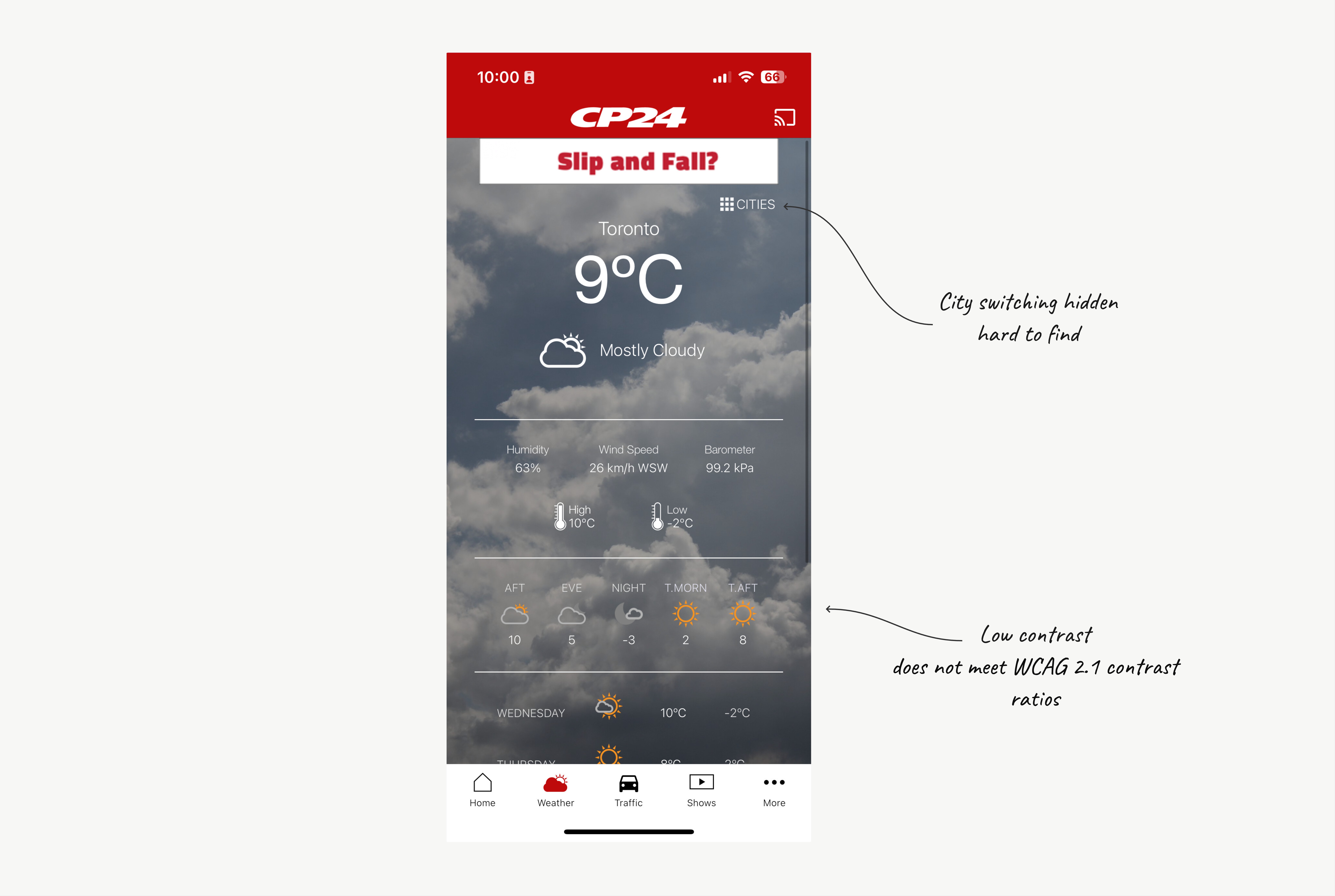
Friction Observed:

Recommendations:
I presented these insights directly with product leadership, engineering, and mobile development teams to align on feasibility and sequencing.
This ensured we prioritized the right improvements before moving into wireframes.
With clear usability findings in hand, I moved into wireframing and iteration.
One of the biggest pain points users experienced was switching cities. They expected a fast, natural way to jump between locations, yet the existing flow required several steps and navigation paths.
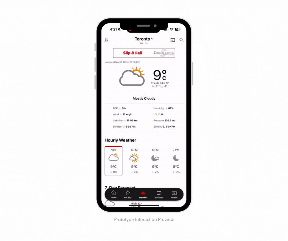
To solve this, I redesigned city switching around gesture-based navigation and streamlined search.
Users could now simply swipe left or right to switch cities, or quickly add and reorder locations based on personal preference.

With user research and feedback as inputs, I redesigned key screens to prioritize clarity and speed.


Once the new Weather tab went live, I ran internal benchmarking tests to validate improvements.
I compared the old and new experiences using completion rates, time-on-task, System Usability Scale (SUS) scores, and reported pain points.

Users struggled to complete core tasks efficiently. Switching cities and scanning forecasts required multiple steps, leading to hesitation and repeated errors.
The redesigned experience reduced cognitive load, simplified city switching, and elevated key weather details. Testing showed faster completion and zero reported confusion.
This project reinforced that improvements to core flows can have outsized impact.
By simplifying city switching and making key weather details instantly scannable, we made the daily weather check feel effortless.