.png)

BNN Bloomberg is one of Canada’s most trusted business news brands, but its mobile app was losing engagement. Users came with clear intent: check markets, follow watchlists, and scan headlines quickly.
I worked with product managers, developers, editorial, UX copywriter, and the design team to define the app’s direction. I led user research, content strategy, and design to make the experience faster, clearer, and easier to use.
The goal was to help users access market insights instantly and with confidence.
.svg)
Before shaping solutions, I analyzed leading news apps to understand how they surface markets, structure personalized feeds, and present editorial content.
The focus was on identifying patterns that make it easy for users to scan markets, navigate news categories, and check tickers quickly.
These patterns became the foundation for how we shaped the new experience.
.svg)
To validate our assumptions, I ran usability tests on the existing BNN Bloomberg app and early redesign concepts.
Participants performed key tasks like checking market performance, searching for a ticker, and navigating to business categories.
I tracked success rates, time-on-task, and SUS scores to see where users hesitated and why.

Based on the feedback received from the user feedback, we made further iterations to the design.
The product strategy focused on reducing time-to-information and elevating editorial storytelling, while giving users simple controls to personalize what matters to them.
.svg)
We redesigned the Home tab to surface breaking news, top stories, and key market signals immediately. I collaborated closely with the editorial team to prioritize story placement and ensure that the most relevant content appeared at the top of the feed.
.png)
Users struggled to find content and often took long paths to find articles. We introduced a dedicated Sections tab to reduce navigation friction and make business verticals easy to reach. This helped users get to the right content faster and aligned the app with how a newsroom organizes information.

Market research showed users wanted quick access to topics they follow daily, so we introduced the For You tab to bring customization forward for the first time. Users can now build a feed around what matters to them in one tap.
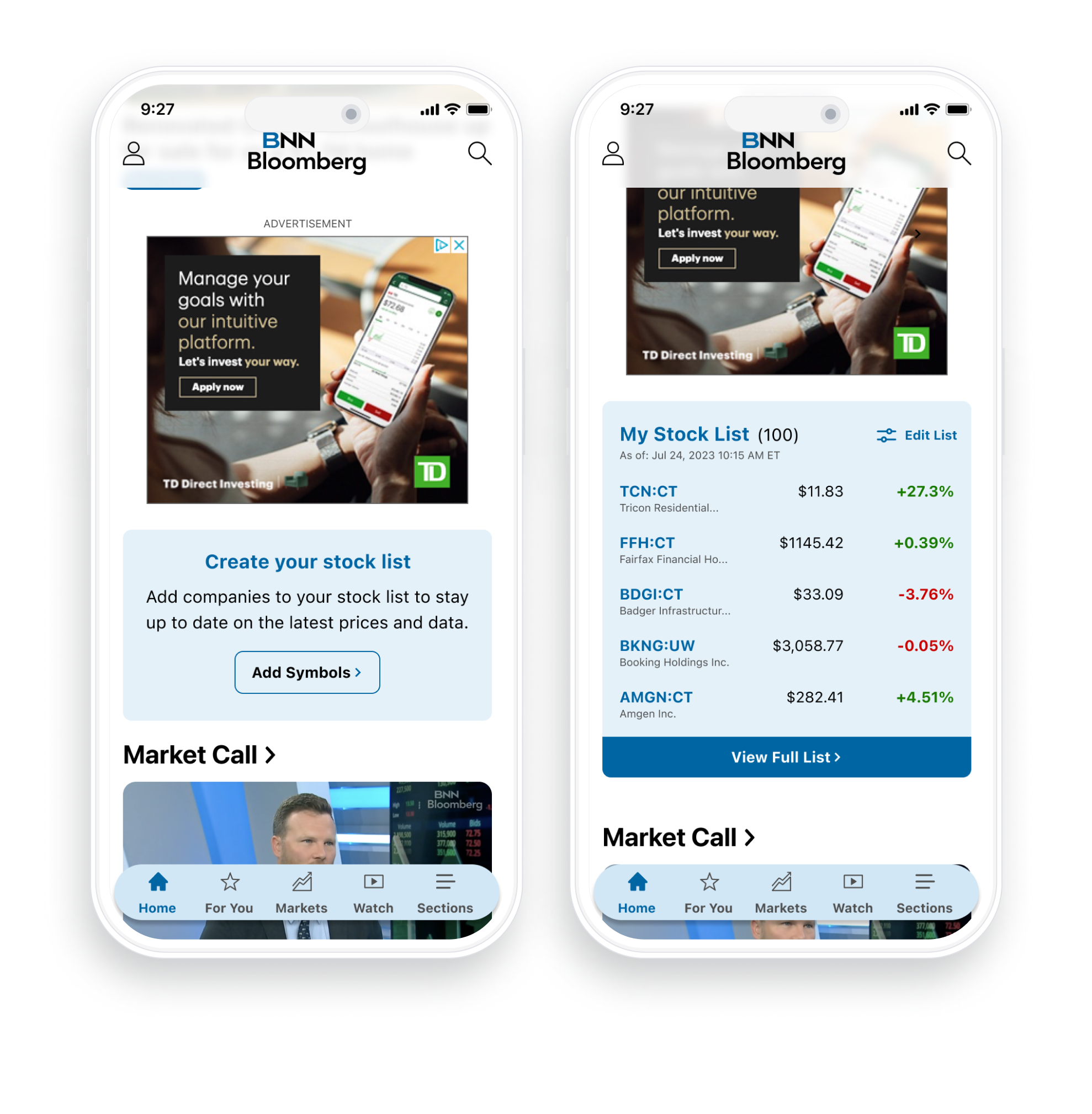
Previously, users had to dig to find their watchlist, which slowed them down. We created a dedicated stock list widget so users can scan their positions and market movers immediately, improving speed and supporting daily market-check habits.

The old stock page separated charts, details, and news, creating unnecessary steps to find detailed stock information. We unified stock data and worked with accessibility partners to ensure readable chart intervals and haptic feedback, improving clarity and confidence for all users.

These designs became the foundation for other Bell Media apps, including CP24 and CTV News. The navigation, personalization, and content-hierarchy decisions proved scalable and helped standardize how we present news and market information across products.